Service description
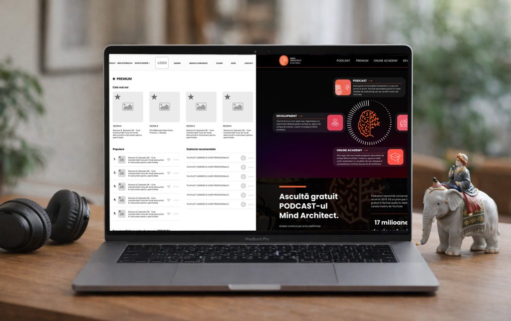
Interface & Design Systems
Structured interface design built for clarity, consistency and long-term scalability across your entire web platform.

The problem
When design lacks structural consistency
Inconsistent design rarely looks broken; it shows up in subtle variations across components, layouts and interactions that gradually erode clarity.
As new pages and features are introduced, those inconsistencies compound, making the experience less intuitive for users and harder to maintain for teams.
Without a clear design system, patterns remain isolated rather than unified and unified patterns are what make digital experiences intuitive and scalable.
How we approach it
Building the User Interface as a System
We don’t start with colors or typography, but with structure.
A strong interface system is built around:
- consistent component logic
- predictable interaction patterns
- clear visual hierarchy
- reusable layout rules
Rather than designing each page independently, we define the foundational elements that shape the experience (grids, components, navigation patterns and content modules) so every new screen is assembled from a coherent system instead of recreated from scratch. Each element has a defined role within the interface, and every variation serves a clear purpose, ensuring that users encounter familiarity.
This structured approach supports both usability and scalability: marketing teams can create new pages without diluting the brand, developers implement features using established patterns, and the overall experience remains intuitive as the platform grows. A design system is not about restricting creativity, but about providing a stable framework that allows the interface to evolve with clarity and control.
What you actually get
-

A coherent visual identity
Typography, spacing, color logic and UI behavior aligned into a unified structure rather than a collection of isolated decisions.
-
Reusable components
Clearly defined interface modules that can be combined and extended without breaking visual consistency.
-
Predictable interaction patterns
Buttons, forms, filters and navigational elements behaving consistently across the platform, reducing user hesitation.
-
Design documentation
Guidelines that clarify usage rules, variations and constraints so future additions remain aligned.
-
Faster expansion
New sections and campaigns can be created within the system rather than reinvented each time.
-
Brand-level consistency
A platform that feels intentional and stable, even as it grows.
Who this is built for
This is a good fit
- You're scaling beyond a simple marketing site
- Multiple teams contribute to content or campaigns
- Visual inconsistency is slowing execution
- You want a design language that supports growth
- You value clarity over stylistic experimentation
This is not a good fit
- You're looking for a quick aesthetic refresh
- You prioritize trends over long-term consistency
- You expect design changes without structural alignment
We can help
Tell us what you're building
If your platform is growing and you want it to feel cohesive rather than patched together, this is where structure makes the difference.
Let’s define a design system that supports your next stage of growth.
Start a project
 Liviu Jurubita